Will print work on clothing be the same colour as on screen?
This is something a lot of people are concerned about and a question we get asked frequently. The short answer is no, what you see on screen will not be the same as what is printed onto clothing. Now for the long version of that answer...
Why print doesn’t come out the same as on screen
 Before going into why colours don’t come out the same we first need to understand how monitors display colours. Monitors work by displaying pixels of light in a RGB format. RGB, stands for Red Green and Blue, with screens using these colours and adding them together in a variety of ways, to reproduce the vast amount of colours we can see on screens. However, here’s where things start to get complicated. RGB isn’t necessarily consistent, it is in fact device dependent, so what you see as one colour on one screen, could well look very different on another.
As well as this just to add another element to the mix, our computer screens are backlit, again affecting how the colours appear on screen (unfortunately clothing isn’t backlit!).
Now with screens working in RGB, for the sake of consistency you would imagine we would print in RGB… Wrong.
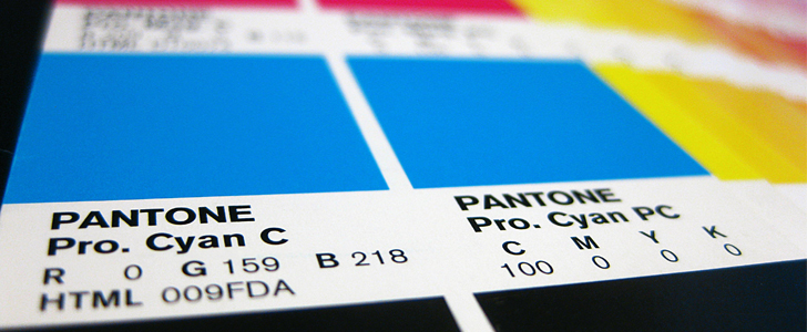
 In most cases we print using a completely different colour system CYMK. The CYMK colour model is a very different process and includes 4 different colours cyan, magenta, yellow & key (black). As a result of using a different colour system that works in a very different way, the colours will always come out slightly different.
A simple way to view this is by thinking back to the last time you printed out a photo that looked great on screen. In most cases once on paper the colours look a little bit different, because you’ve been printing using CYMK and your paper isn’t backlit like a screen.
Pantone matching
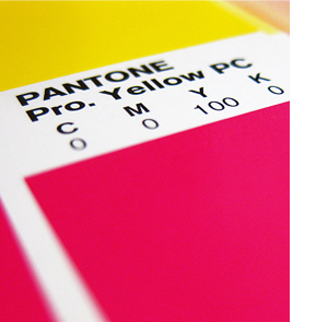
 Now one way many companies try to keep consistency across their brand colours, is through the use of Pantone colours. The Pantone Matching System (PMS) is a system of thousands of numbered swatches; companies often have their own Pantone colours, enabling them to simply reference a specific colour that can then be matched across all materials. However, there is again a catch. Your screen cannot display Pantone colours, nor can they be printed with a standard digital printer. This means only companies that are able to Pantone match are able to produce products in your Pantone colours. As a result, what you see on your screen will not be the colour you get on your garments, it will be something similar, but it won’t be exactly the same.
Despite not showing on screens accurately Pantone matching is the industry standard way of matching colours.
How do I know how my colours will come out?
While we can’t promise colours will come out the same as how you see it on screen (you now know why!), we can assure you it will normally be very similar, with very few people actually noticing a real difference.
If you are a bigger company, you will most likely have a Pantone reference number for the company colours. With this information we can in fact match this colour, so the colour of the prints on your clothing will be consistent with the rest of your branding.
While it’s normally best to use Pantones, where this is not possible, always ensure you provide the right files and in the right format, this will help ensure the closest possible colour match.
We understand that this is quite a complex topic, and can be a little worrying when you just want things to come out perfectly; so if you do have any questions or concerns around printing we’re always available to help just get in touch.
If you found that useful, you may well find our Newsletter pretty handy too! You can sign up to the Newsletter at the top left hand side of this page!

